UI Design
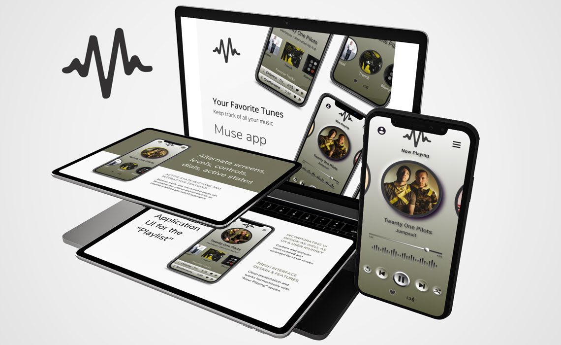
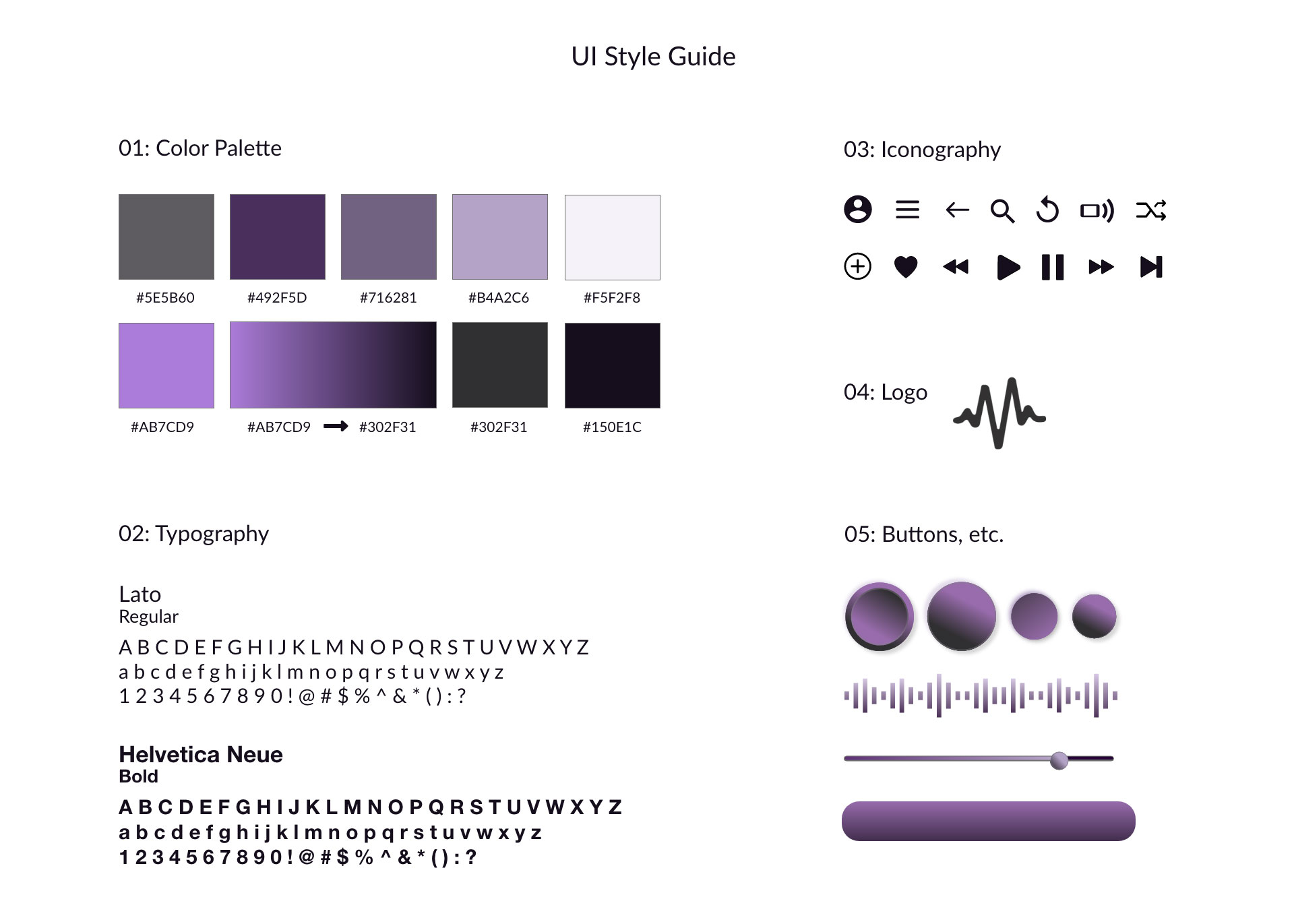
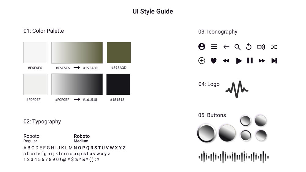
To maintain consistency, a UI guide was required. This guide kept all of the individual
elements, logo, type rules, color codes, icons, transitions, buttons etc. that make up
the user interface designs for the app, all together in one document. This would then be
used by their in-house team to roll the designs out across the whole app.
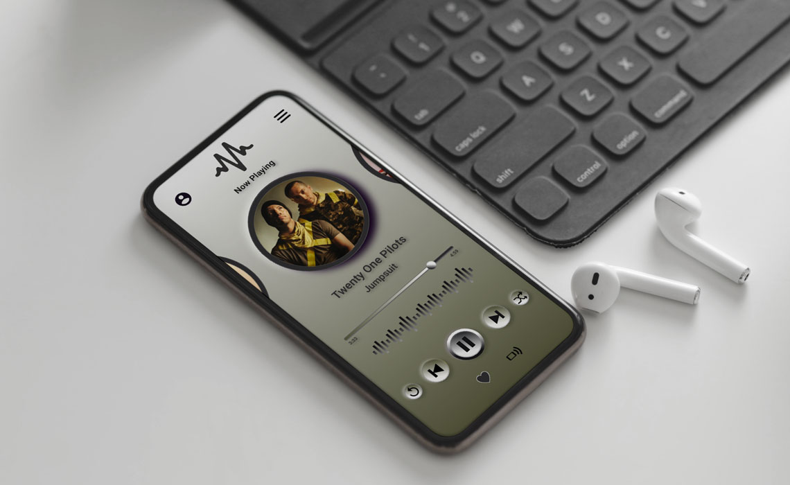
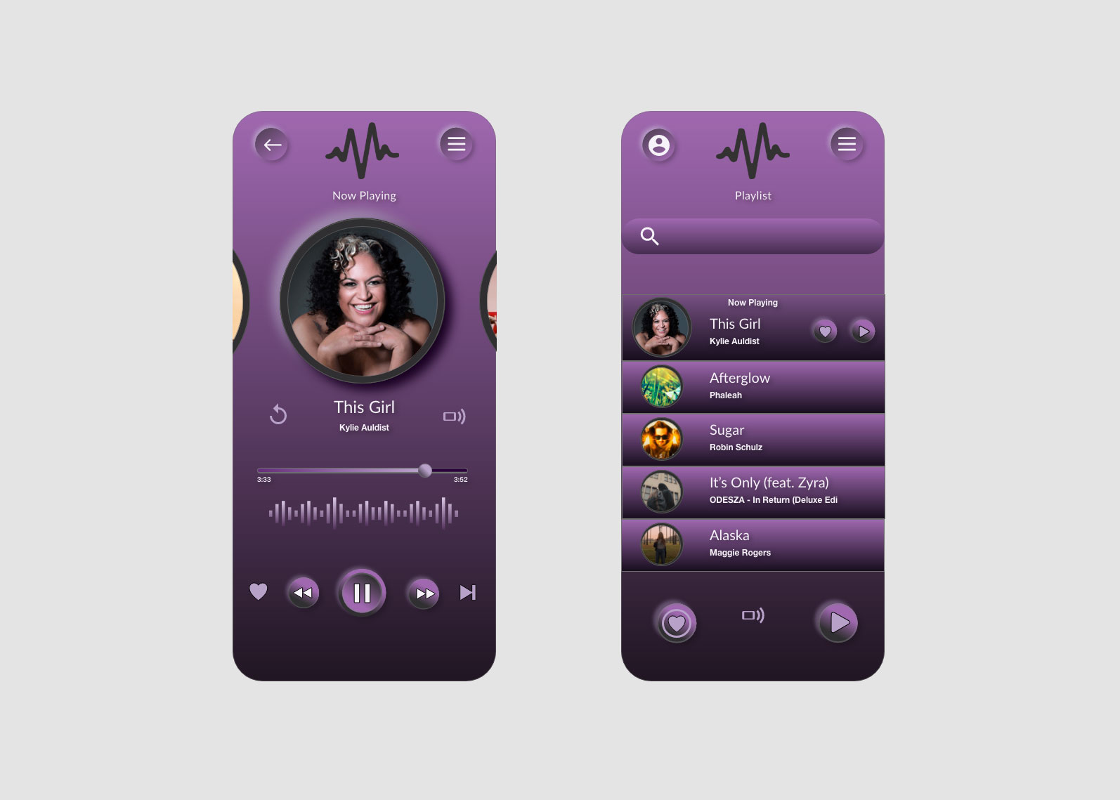
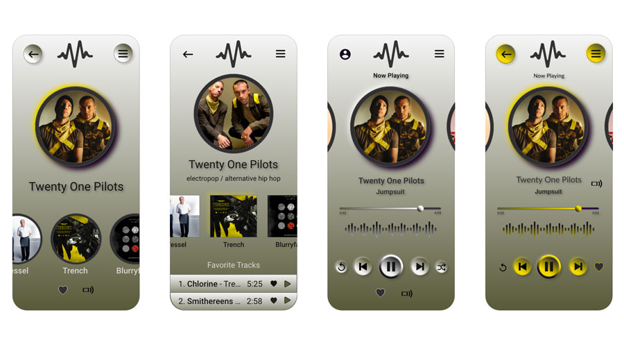
With this particular design I implemented various gradients which I thought played well
into the theme and gave a depth and 3D feel for the buttons and also offered some
dimensionality to the backdrop and features.
The iconography I chose was simple, clean, and fun and worked cohesively with the font
type pairings, which were easily readable and did not detract from the boldness of the
theme. I liked how the dancing sound decibel chart complemented the Muse logo, and also
the decision to use gradients throughout the interface.


